
FOLLOCA
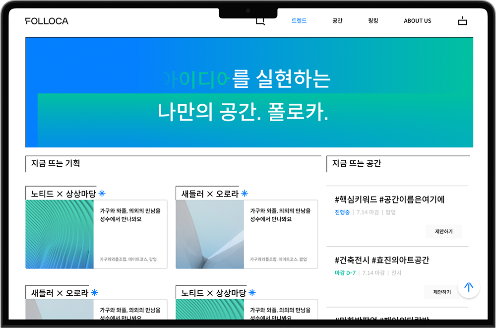
2022 ⸻ 2023FOLLOCA is an online platform for people to share and promote their spatial ideas in a rented space. I participated as a WEB DESIGNER / ASSISTANT PM for this team project with 3 front-end developers, 2 back-end developers, one project manager, and one brand identity designer.①
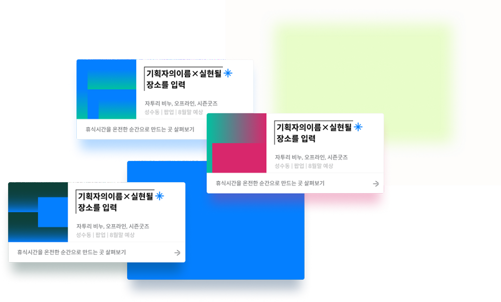
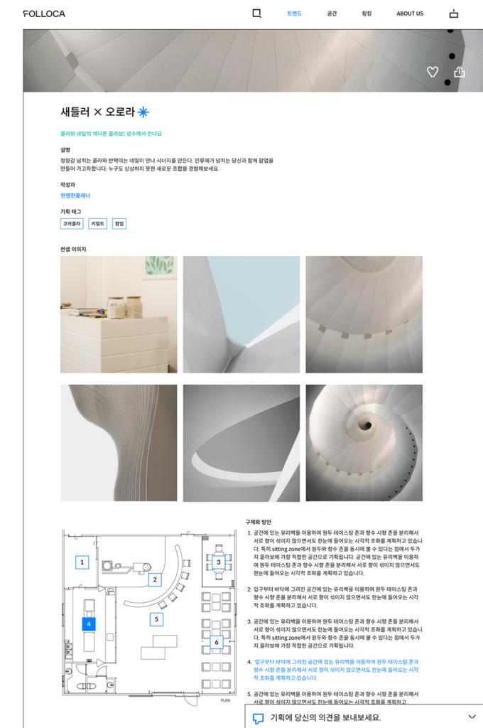
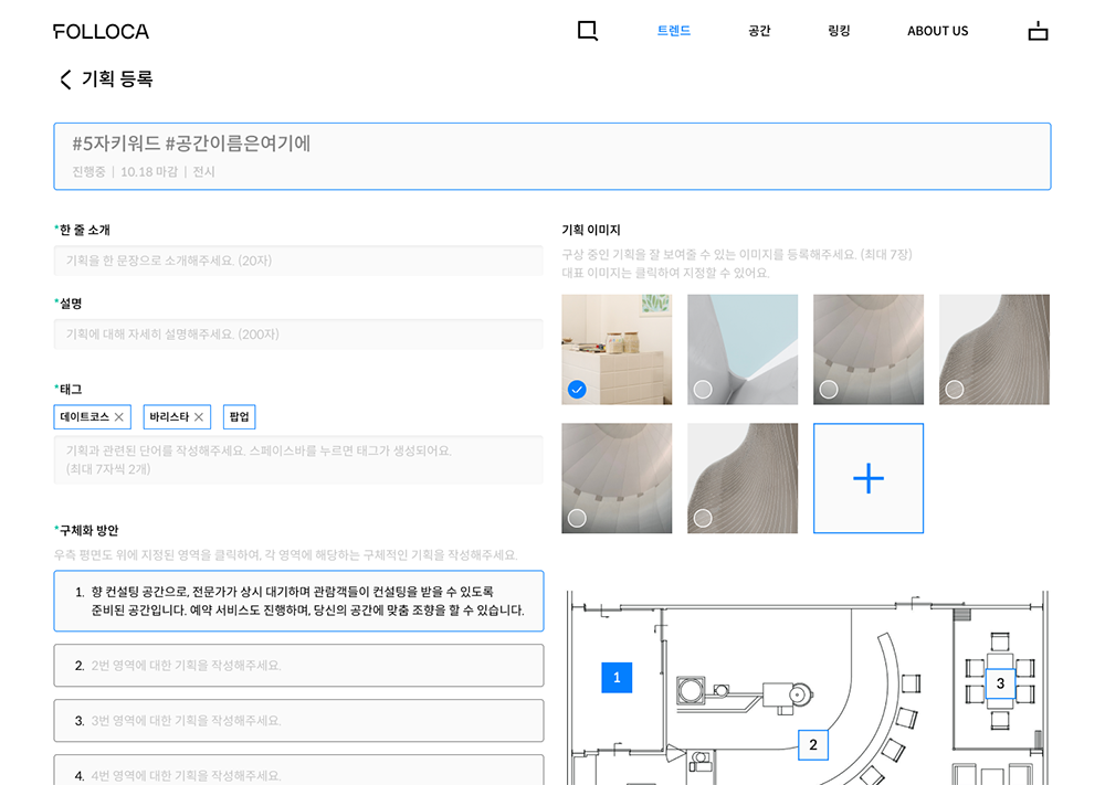
The logo for FOLLOCA② embodies some architectural characteristics. Thus, I replicated the biggest key visual from “F” in the design. The L-shaped space dividers③ best represent FOLLOCA’s spatial characteristics. These bracket dividers are integrated throughout the design.④—⑤
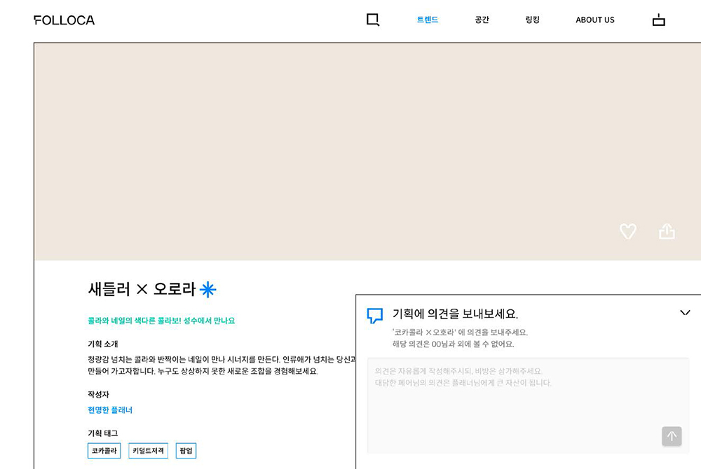
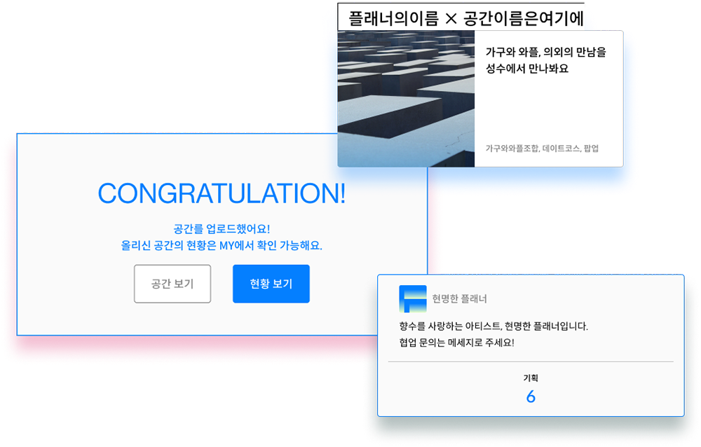
Since FOLLOCA was created for Space Curation⑥, the website is focused on how to express creativity in a less restricted form. Curators can easily visualise the space through the website⑦ and viewers can suggest their own perspectives and ideas to the curators.
